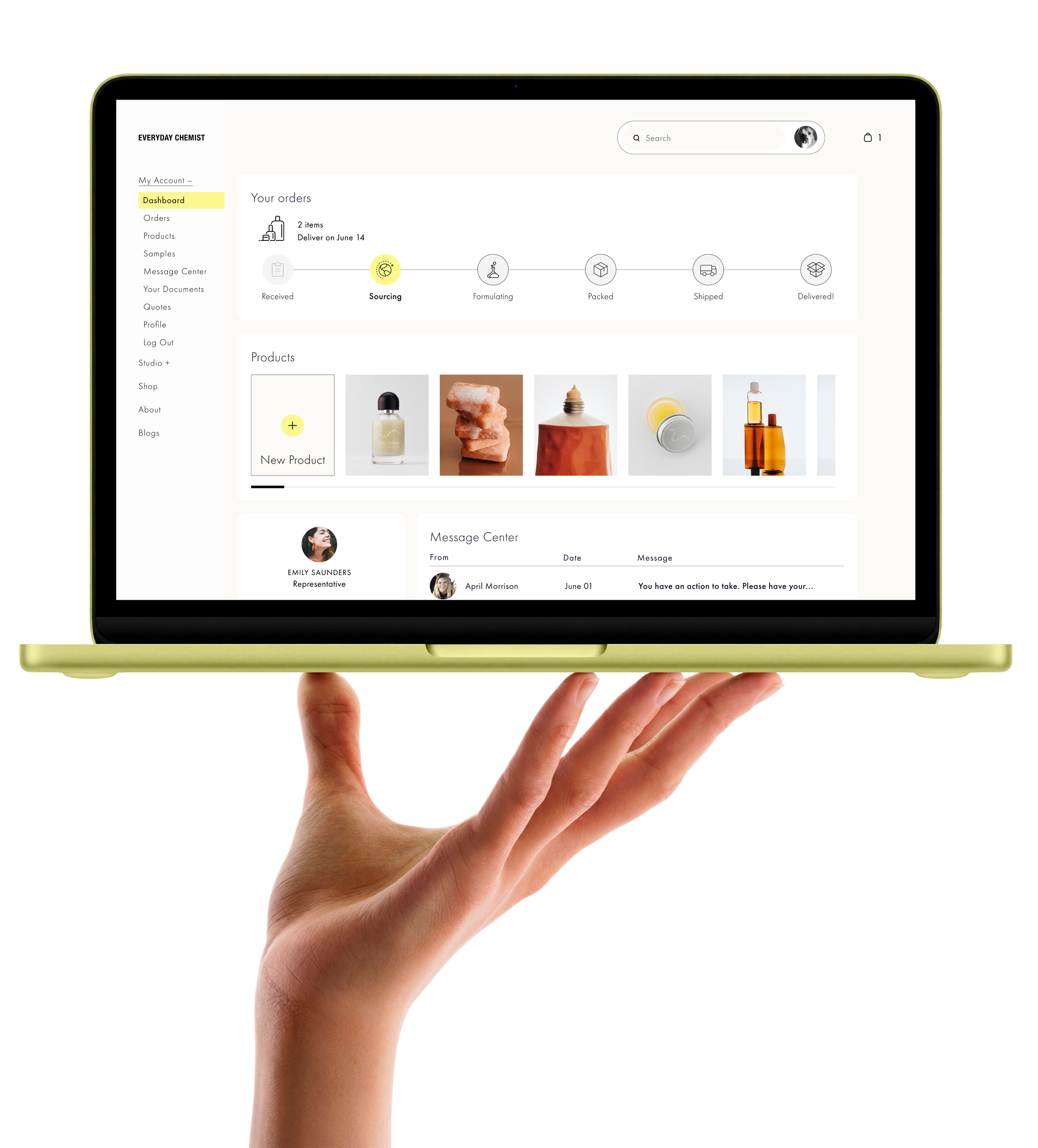
Everyday Chemist B2B Onboarding: Conceptualizing a Streamlined Architecture for Custom Cosmetic Scaling
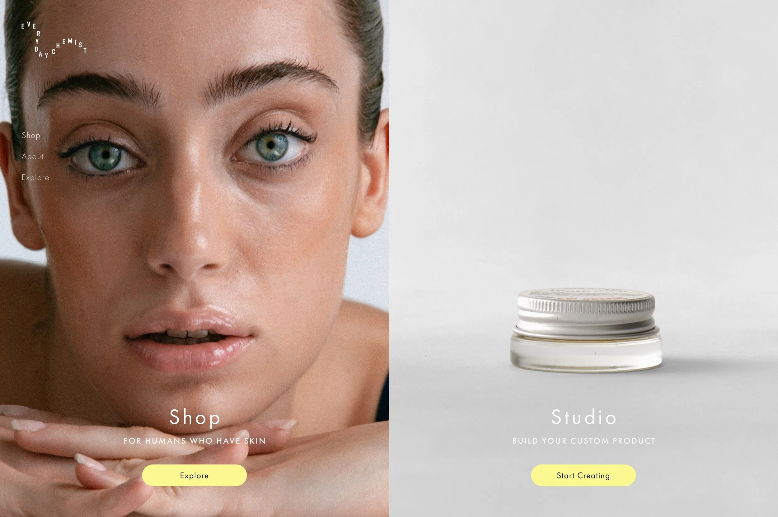
Overview, Role & Team
Partnered with Everyday Chemist—a digital platform connecting indie cosmetic brands with premium, sustainable manufacturing resources—to architect a scalable B2B onboarding experience. Transformed a fragmented, friction-heavy intake funnel into an intuitive dashboard system under a compressed 4-week timeline.
Duration: 4 Weeks (May – June 2024)
Role: UX/UI Designer (Cross-functional collaboration)
Tools: Figma
Deliverables: Dual-Route Task Flows, Interactive Mid/Hi-Fi Prototypes, Developer-Ready Component Library
The Challenge & Core Friction Point
The Context: The cosmetics manufacturing supply chain is complex, opaque, and fragmented. Emerging indie brands struggle to source reliable raw ingredients, while legacy suppliers lack streamlined ways to vet small-scale partners.
The Product Problem: Everyday Chemist needed a digital intake strategy to handle client lead qualification. However, initial analysis revealed a major product risk: their customer base is split between two completely opposite user profiles. A single, linear onboarding form would fail both.
Novice Creators need educational guidance, scaffolding, and hands-on handholding to define their product needs.
Industry Veterans already have professional product briefs ready; forcing them through a long onboarding quiz introduces friction and causes massive funnel drop-off.
The Strategy: Design a Dual-Track onboarding strategy that accurately segments users at the very first screen, providing a personalized funnel without duplicating development effort.
Learning from Competitors
We evaluated Atelier, a primary competitor in the cosmetics sourcing space, to map out the highs and lows of their intake experience:
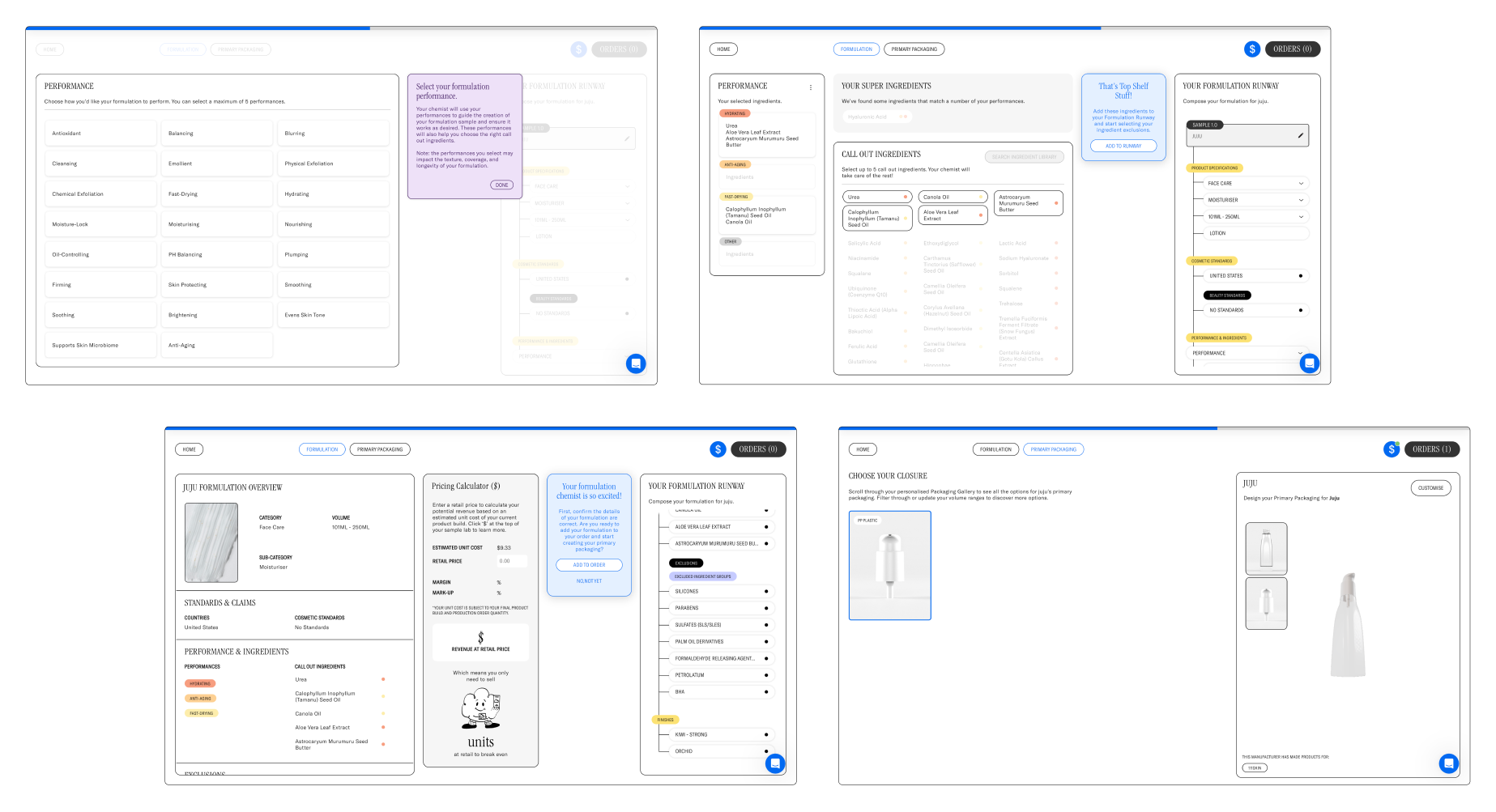
Competitor analysis: Atelier's onboarding experience. Performed a heuristic evaluation.
Strength
Visually appealing imagery.
Build-a-product preview feature that that drives anticipation.
Detailed instructions and a help chat function empowers users to navigate the platform.
Weakness
Placement of Call-to-action buttons and design layout inconsistency, hindering user engagement.
Cluttered layout and lengthy tooltips can be confusing and impede intuitive navigation and slowing down the task flow.
Takeaway
Everyday Chemist wanted an onboarding experience similar to Atelier’s experience but dramatically simplify the navigation and structure. The audit allowed me to gain insight and context for this project. It helped me understand cosmetics formulating and manufacturing before heading into the project.
What Real Users Need
Overarching themes and patterns influenced users needs: time management, knowledge of the process, and industry experience. 100% of participants wanted control, but newer creators needed guidance while experts wanted zero friction.
“I have a very specific vision for what I want, but I’m not a chemist. I know exactly what I want the product to do, but I don’t know how to specify the raw resources.”
— Emerging Brand Creator
We analyzed qualitative data from three strategic user interviews representing different tiers of the market. The data revealed several core needs:
100% of participants were open to a paid service.
Experience level dictated specific needs.
100% utilized Google apps in their business operations.
Two of three saw significant value in the proposed service.
One prioritized complete control over their process.
Analyzing the Data: The Affinity Map
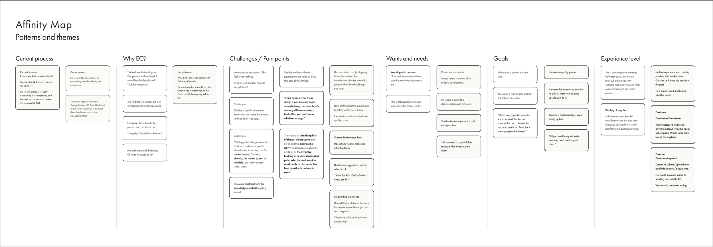
After our interviews, we synthesized the transcripts into an affinity map to uncover core themes.
The data revealed a stark contrast in user needs: less experienced creators desperately needed step-by-step guidance, while seasoned pros wanted absolute autonomy over their process. Despite these differences, every participant emphasized two non-negotiables. All participants were adamant about creating their own vision. Trust was an important aspect as well as catering to the client's needs in a customized experience.
All participants saw the value in the platform with differing ideas on how it would serve their particular needs. Subscription service along with one-off projects in instances of smaller projects or the need for independence.
This exercise was the catalyst for our dual-track onboarding strategy.
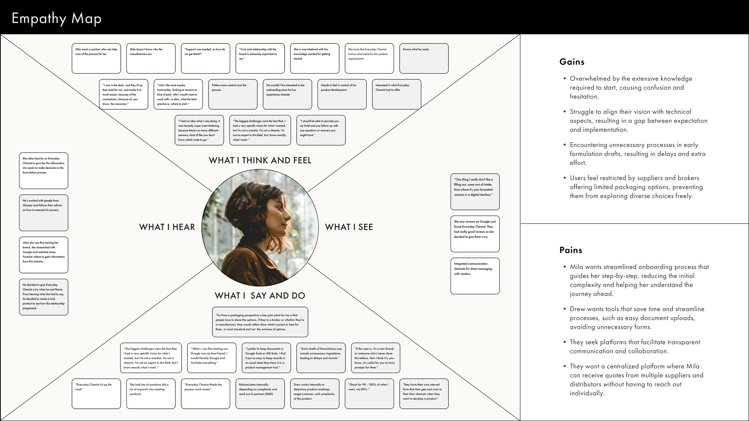
Synthesizing the Empathy Map
As a team, we mapped out our users' thoughts, actions, and pain points, updating the map as new interview insights came in. This collaborative synthesis bridged the gap between our research data and design decisions, clearly highlighting the contrasting user needs that directly shaped our two distinct personas.
Defining the User Personas & Flows
To map the digital architecture, we synthesized our insights into two distinct structural personas. This helped identify early features based on the more personal goals, needs, and pain points of our users.
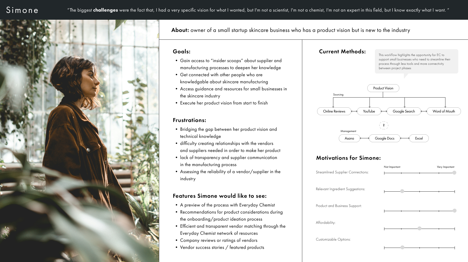
Simone, who is new to the industry, needs help to execute her vision from start to finish, step by step.
Finding a trustworthy, knowledgeable partner who can take her through the whole process is most important to her.
Simone (The Guided Track)
Novice to the cosmetics industry.
Has high creative vision but no technical chemistry background.
Her user journey map proved she required step-by-step guidance, clear milestone tracking, and embedded educational context.
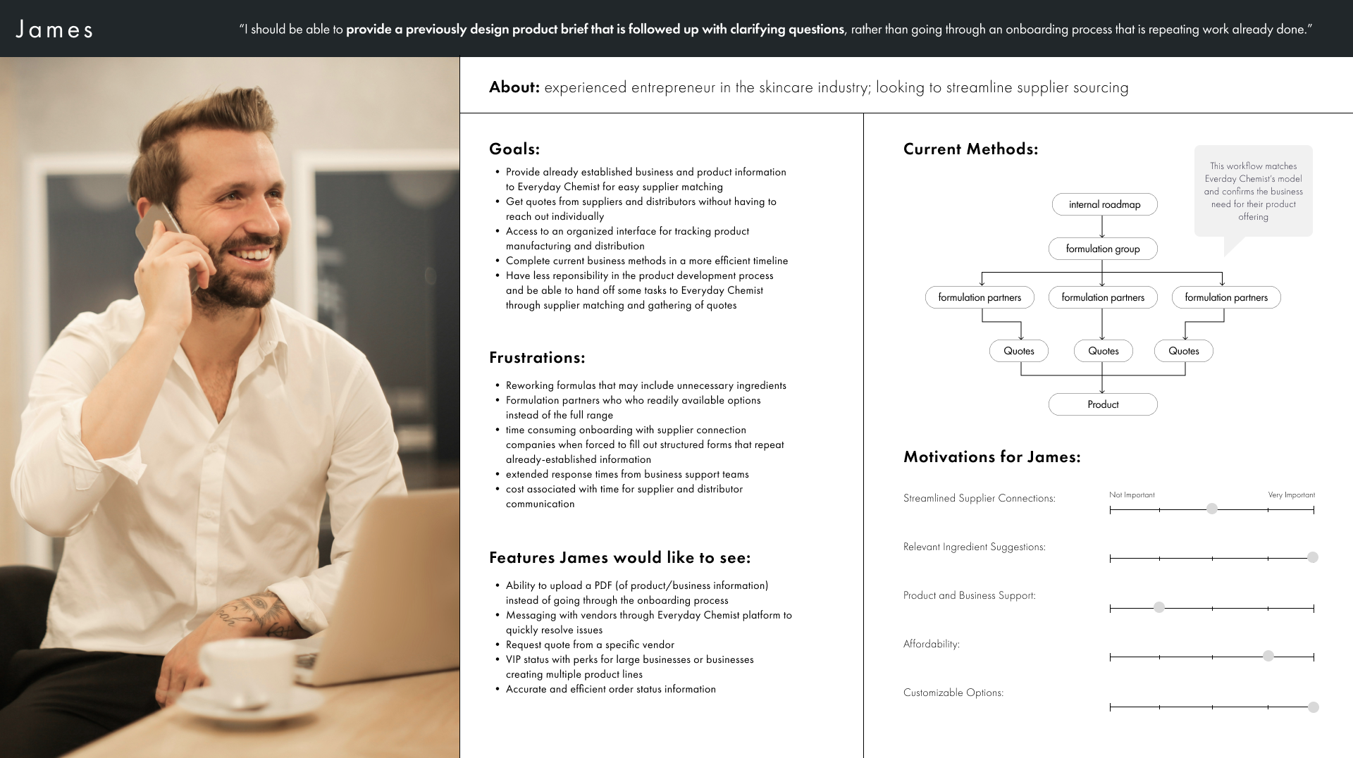
James, experienced in the beauty industry, knows what he wants to make his vision come alive.
He knows how to execute it. He wants a partner who will take his brief and strictly follow it. Suggestions are welcome, but not without his approval to implement.
James (The Fast Track)
Expert beauty industry professional.
Works efficiently and wants complete control.
His user journey map highlighted that any mandatory tooltips or repetitive forms would cause immediate drop-off.
Requires a simplified document-drop to upload pre-existing specifications.
HMW Statements
Problem: The complex and fragmented cosmetics supply chain creates challenges for brands, including difficulty finding reliable suppliers, a lack of transparency, limited access to resources for new brands, and hurdles to innovation.
“The biggest challenges were the fact that I had a very specific vision for what I wanted, but I'm not a scientist, I'm not a chemist, I'm not an expert in this field, but I know exactly what I want.”
—Simone persona
“I should be able to provide a previously designed product brief that is followed up with clarifying questions, rather than going through an onboarding process that is repeating work already done.”
—James persona
How might we provide users with a step by step onboarding experience where they can customize their experience to get the best product from Everyday Chemist?
How might we accommodate and add value for an experienced industry professional who doesn’t need hand holding throughout the process?

Mapping User Task Flows
We mapped out five potential user paths to guide our initial sketches. Because of our tight 4-week timeline, we chose to focus on the most critical, foundational flow: a new customer with a product brief filling out the intake form. This core flow touched every other path and gave us the strongest structural blueprint to start designing.
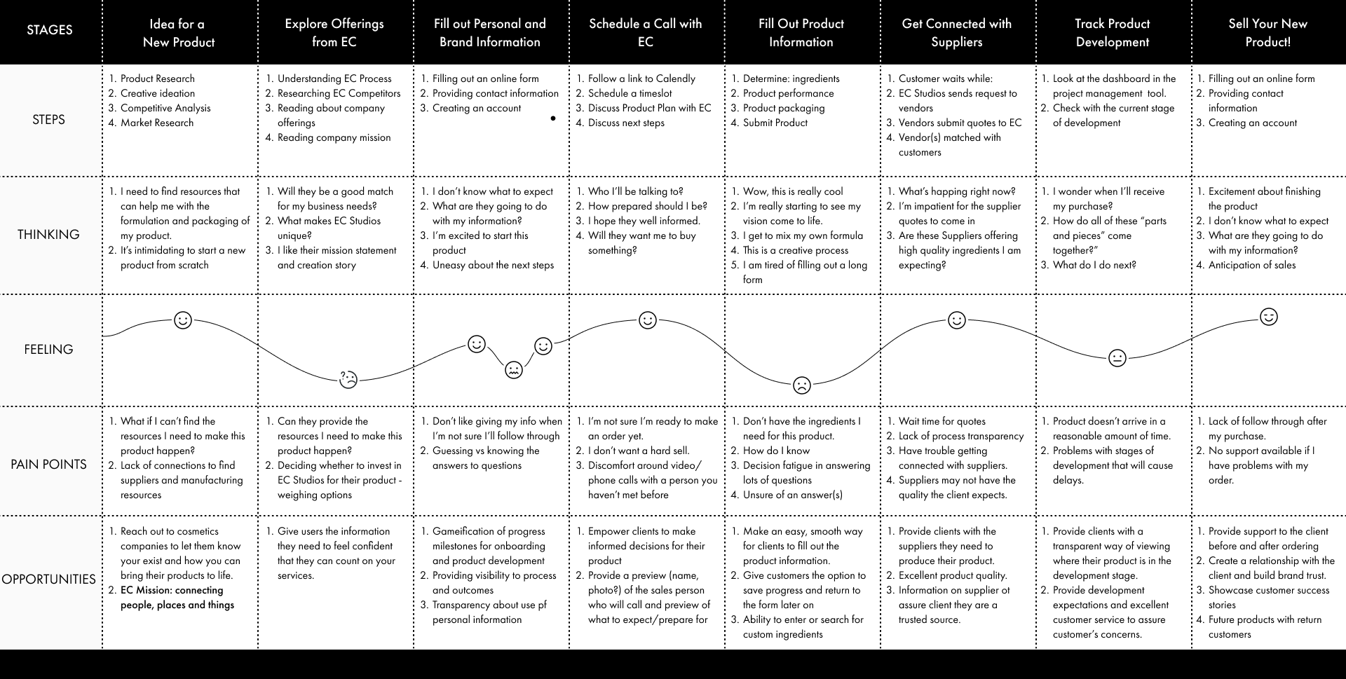
Mapping the User Journey
I co-created a user journey map to track how clients feel when developing a new product. This helped us pinpoint the exact moments users experience friction before reaching their final formulation.
A Great Team Learning Moment: This was a highly collaborative effort. My teammate initially helped me bridge the gap between our raw research and the map steps. I then took ownership of filling out the details, and we refined it together. This exercise was a fantastic way to sharpen my mapping skills and ensure our onboarding design anticipated every user need.
Interactive Ideation and Design
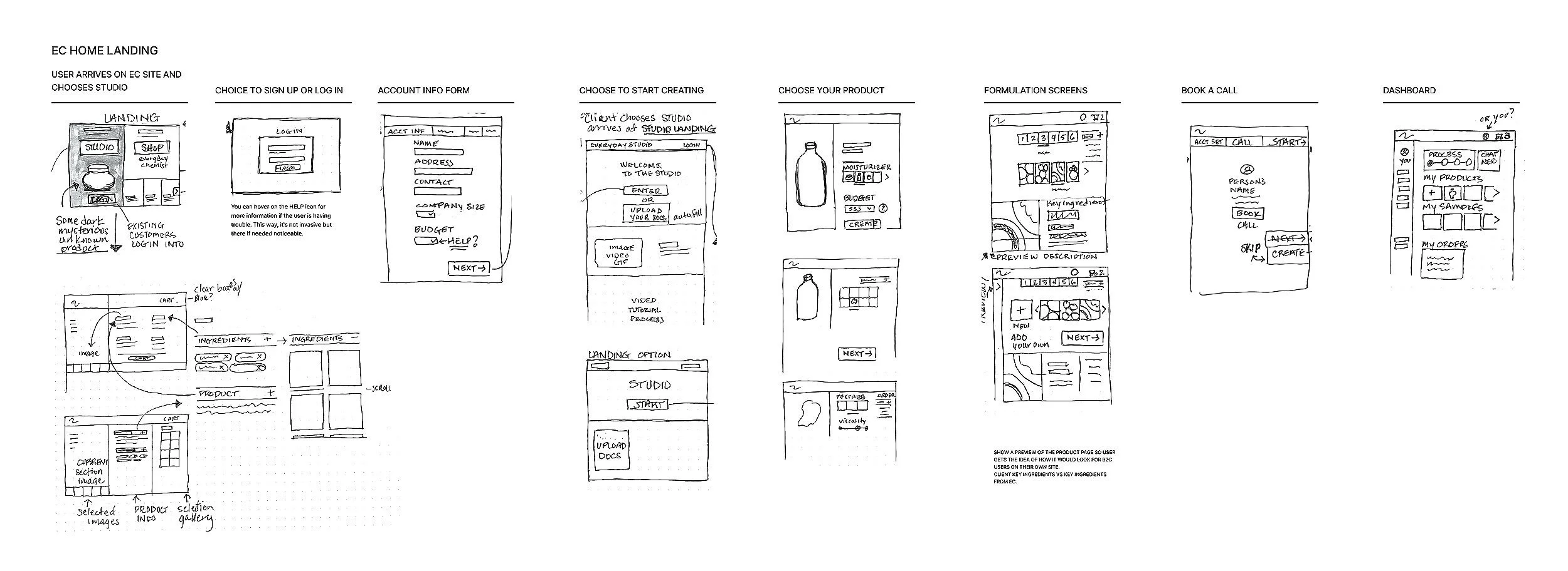
Our team ran rapid design sprints, moving from individual concept sketches to aligned low-fidelity wireframes.
For the sketching phase, we each created individual versions representing our ideas for the app's functionality. We then convened as a team to discuss all the sketches and collectively decided which ones to develop further into Lo-Fi wireframes. Narrowing down the selection proved challenging, but we ultimately reached a consensus.
Journey to a High-Fidelity Prototype
The final phase focused on turning our structural logic into a polished, desktop interface that matches the elegant modern style of Everyday Chemist’s brand and the expectations of the cosmetics industry.
Testing the Blueprint: Low-Fidelity Wireframes
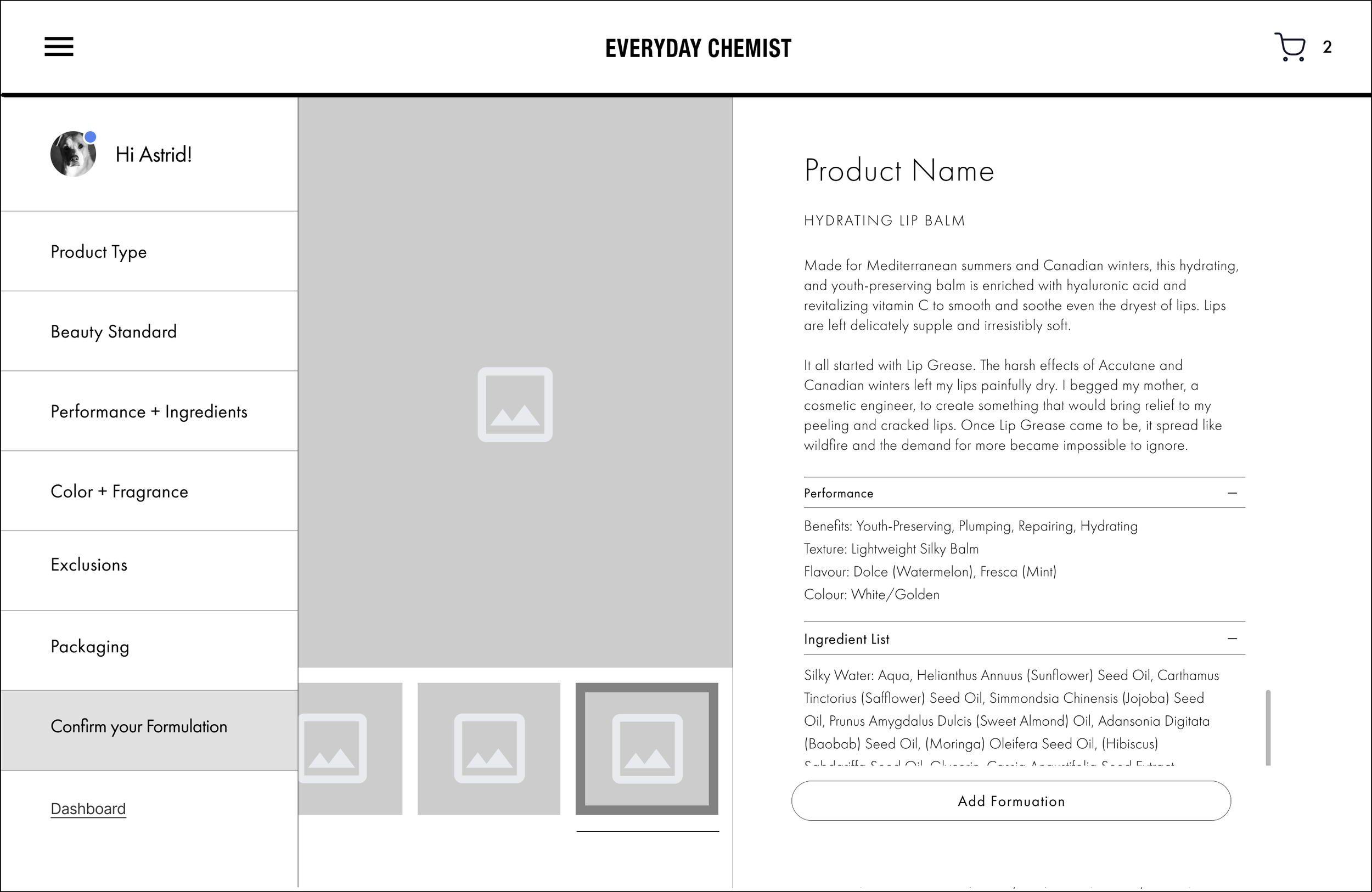
We translated our sketches into low-fidelity wireframes and built a rapid prototype to test with our stakeholders.
The Goal: Validate the dual-track structure early. We needed to ensure the layout felt intuitive and captured the right information without causing user fatigue.
The Outcome: The test gave us a green light on our structural logic while pinpointing a few necessary content adjustments. This saved us days of guesswork and gave us a validated blueprint before moving into high-fidelity design.
Adapting to System Constraints: Mid-Fidelity Wireframes
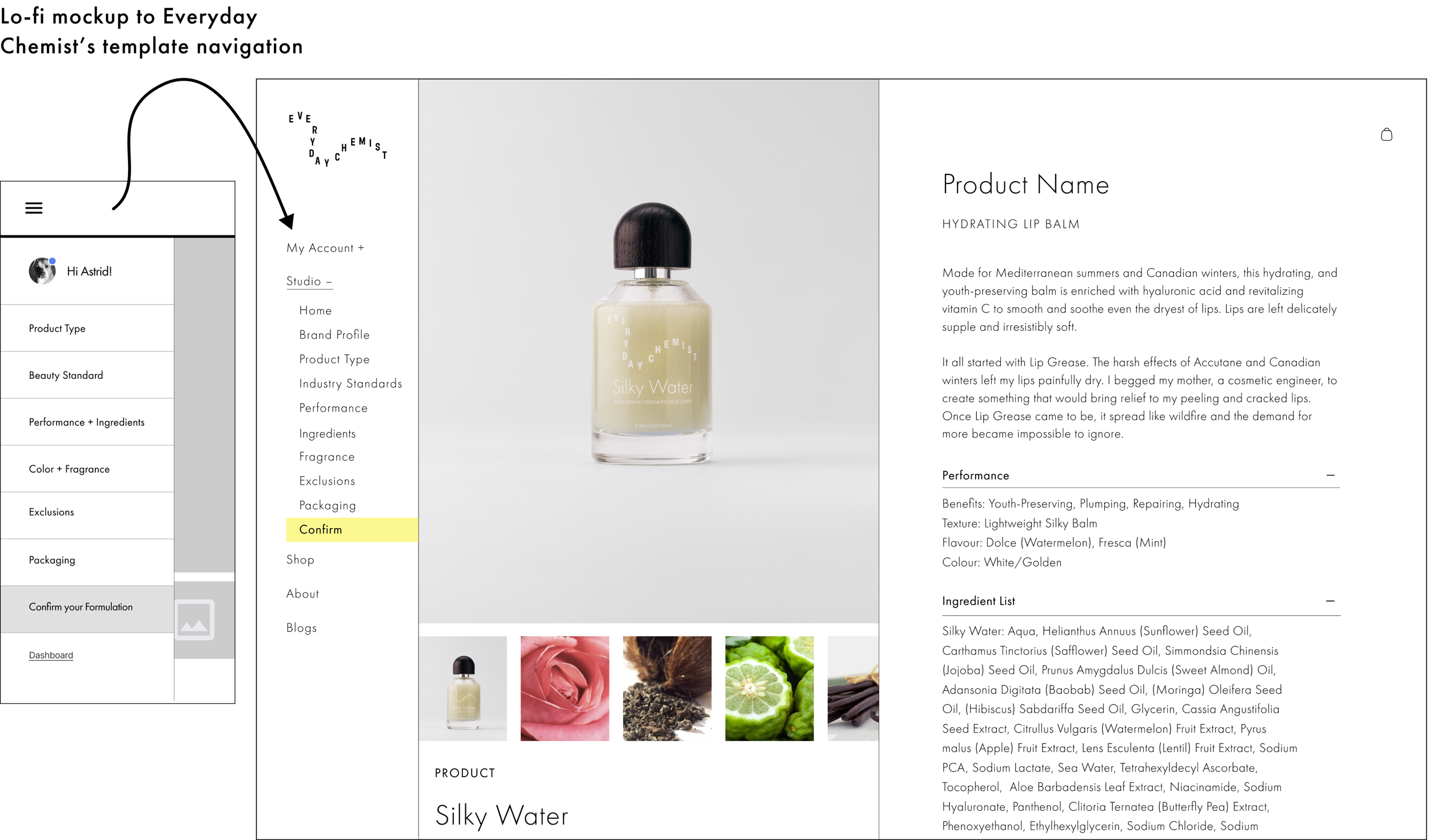
Our initial layout used a standalone wizard, but stakeholders requested we use their existing left-side navigation menu for platform uniformity.
I integrated the onboarding screens directly into their current menu framework. This kept the branding consistent, minimized extra coding for the developers, and gave users an early preview of the actual dashboard layout.
Final Touches: Hi-Fidelity to Prototype
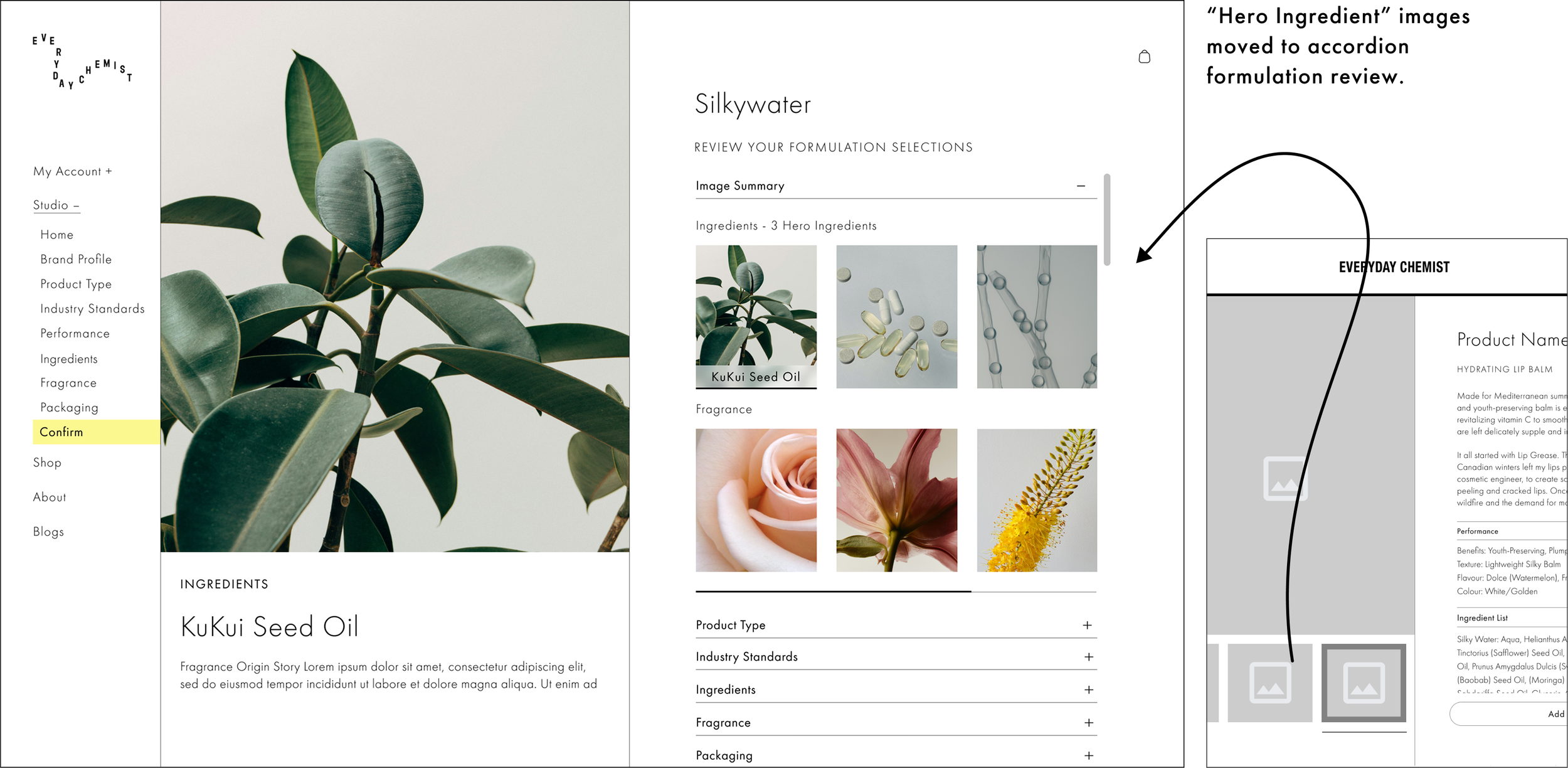
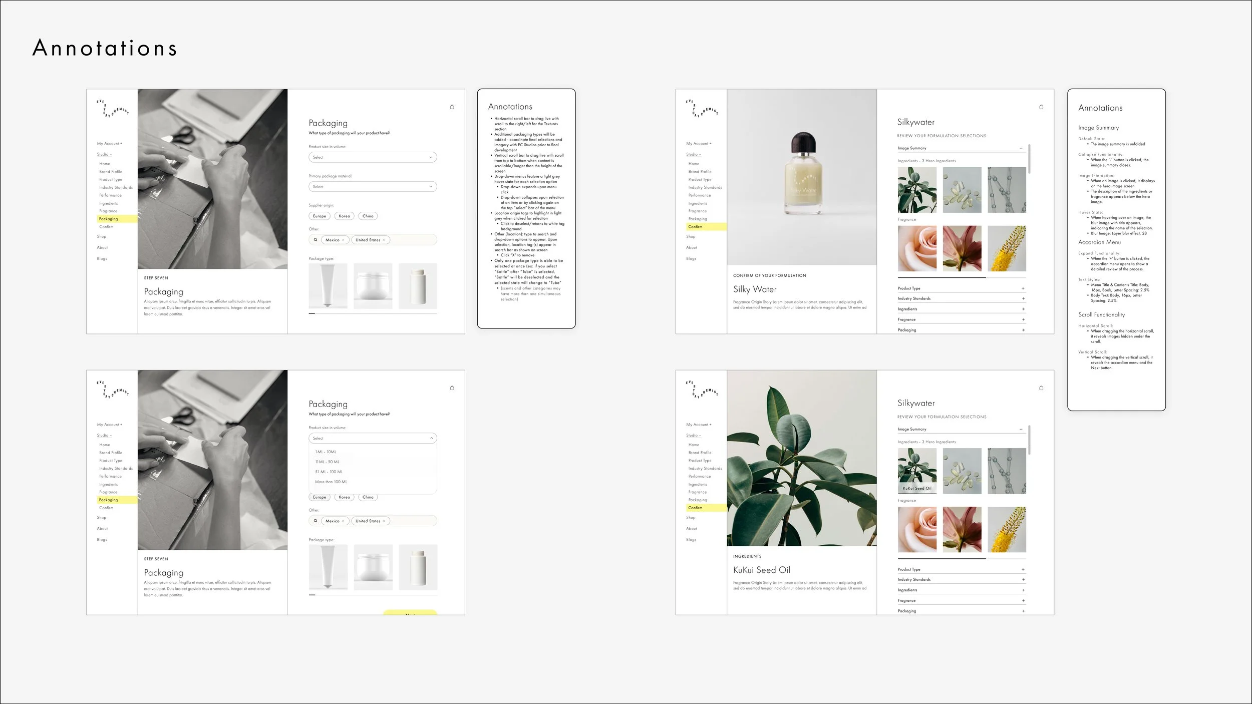
We presented high-fidelity mockups and received valuable client feedback for final edits. Here, we moved the heroingredients image gallery into the “Review Your Formulation” column in a collapsible accordion element.
Scalable Design Infrastructure
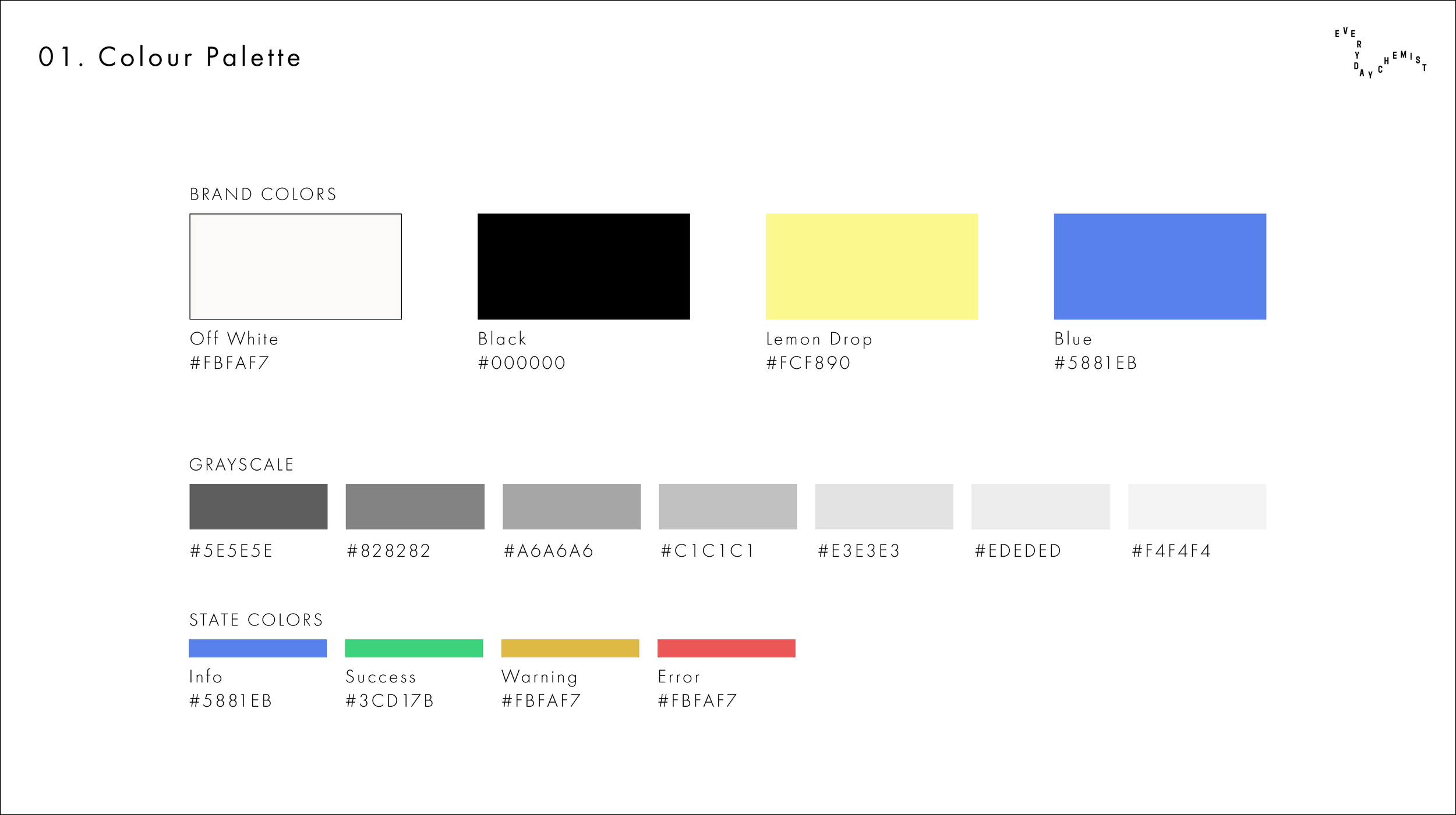
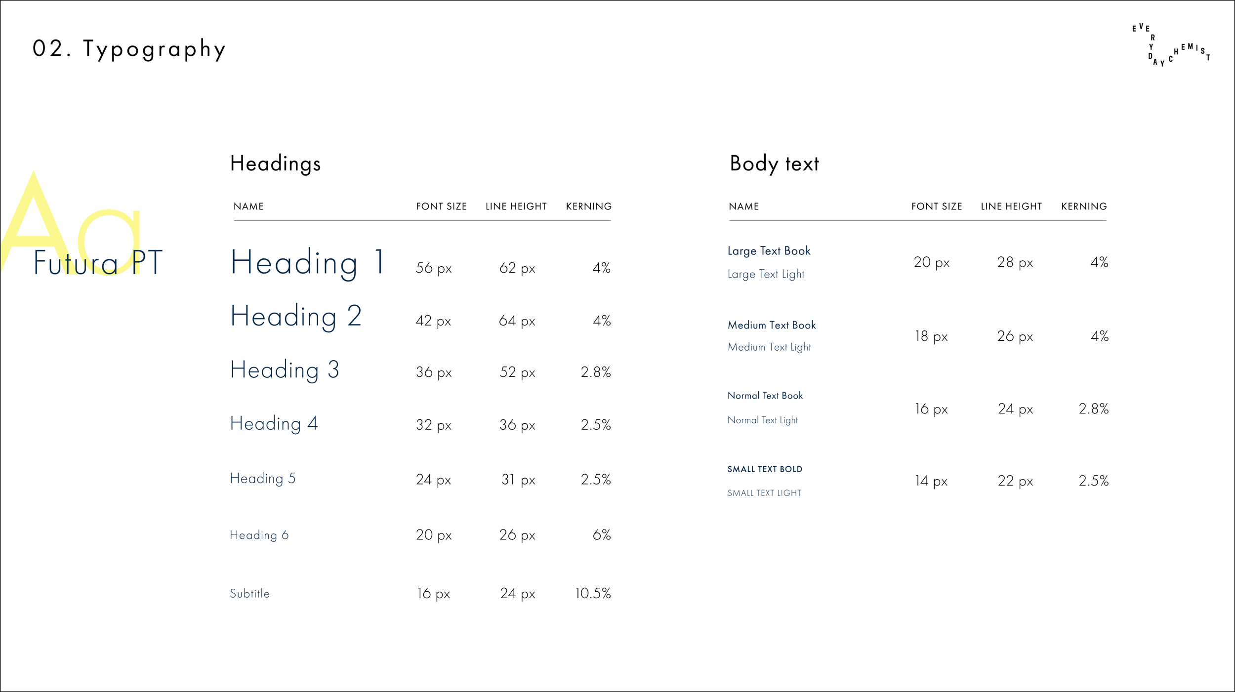
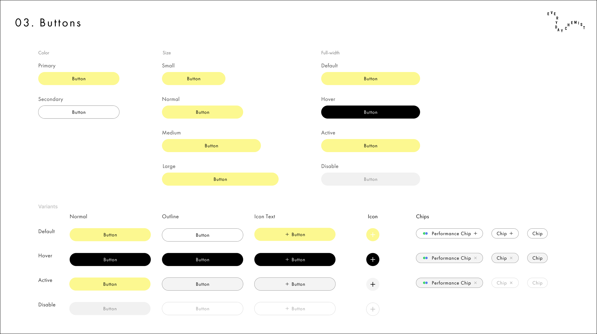
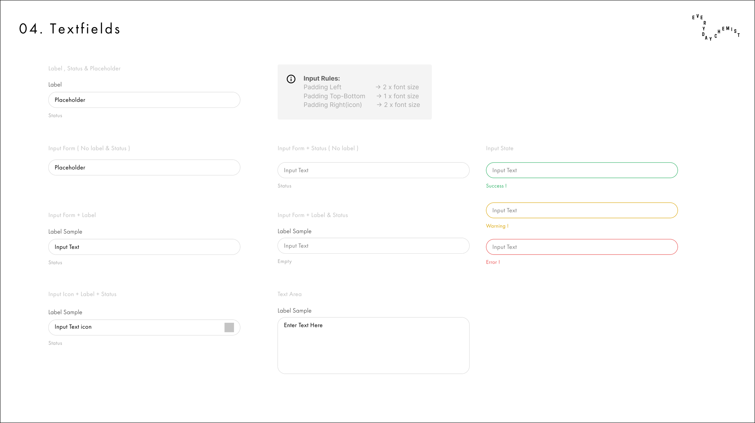
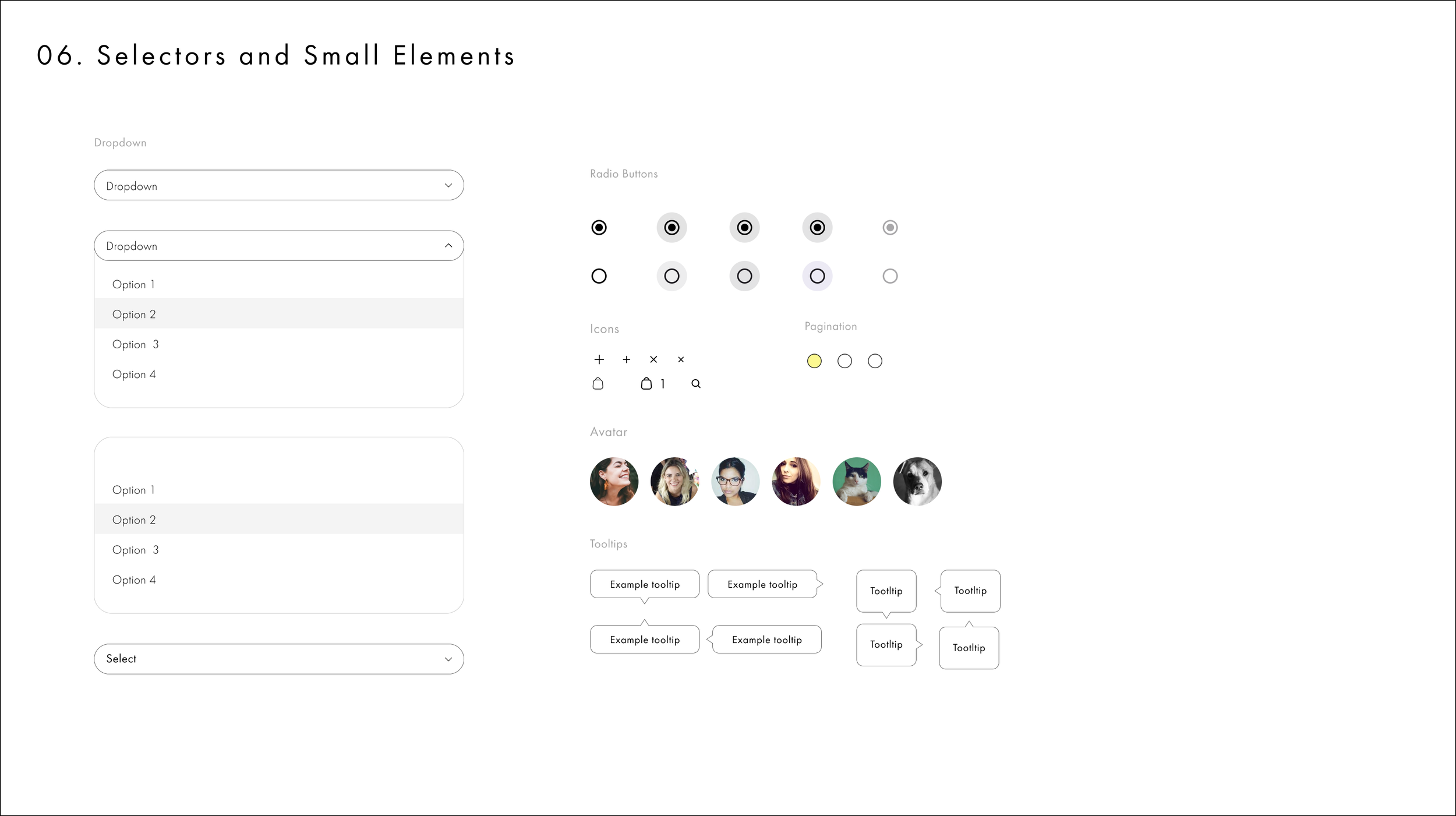
Final preparation for handoff, I compiled the design system, style guide, adding annotations for the client and developers, and final assets for on-time delivery. Figma Design System and component library: All UI components, states (default, hover, active, error), typographic scales, and assets were fully annotated with clear developer guidelines.
Value Delivery & Strategic Roadmap
Despite a fast-paced four-week timeline and initial workflow hurdles, our newly formed team stayed on track and delivered a project we are incredibly proud of.
Stakeholder Alignment: Delivered an interactive prototype that successfully aligned business goals and engineering considerations, earning strong approval from client leadership.
Engineering Readiness: The fully documented component library ensures their development team can deploy this onboarding flow with consistent visual polish and minimized implementation friction.
Future Product Roadmap: Outlined clear future-state iterations for their product team, including live interactive dashboards, and automated form fields, document uploads.