Willow Help Center — Balancing a Redesign with an Evolving Brand Overhaul
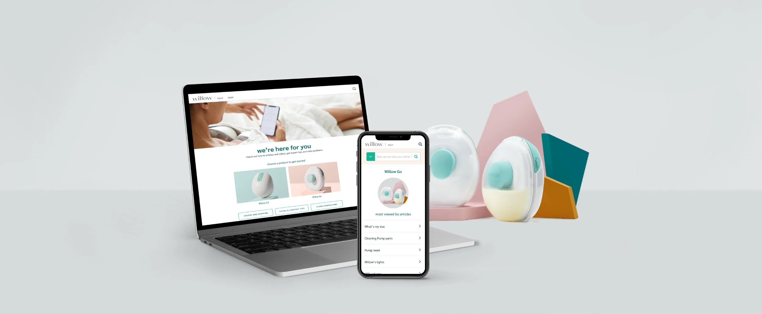
Overview, Role & Team
The Mission: Redesign Willow’s outdated Help Center in 3 months. The goal was to build a clear, mobile-friendly troubleshooting experience that could support upcoming product launches and match their changing brand style.
My Role: Senior Visual Designer. Led end-to-end UX/UI, interaction design, and visual infrastructure. Responsibilities included ideating concepts based on user data, presenting to leadership, and delivering final production assets.
The Team: Partnered with the Creative Director, Project Management, Head of Mom Experience, Technical Program Manager, Creative and Product Team members, and Developer to ensure a seamless, cohesive user experience.
Tools: Figma, Adobe Creative Cloud.
The Problem
The existing Help Center was outdated and couldn't support Willow's upcoming product launches. The content and branding was outdated, the user experience was clunky with high customer support ticket volume and bounce rates.
Solution: Moms need quick, seamless troubleshooting to get their pumps working without frustration. Additionally, the final design needs to be flexible enough to accommodate a rolling, incomplete brand overhaul.
Strategy: Design a new Help Center with articles, embedded videos, step-by-step interactive troubleshooting responsive website. Striking a balance between self- serve and human support. The design look and feel should to be a basic structure that can easily be updated as the new brand evolves.

The Business & User Friction
The existing Help Center was visually outdated and structurally unable to support Willow’s rolling product launches. Crucially, the system had to absorb an incomplete, evolving brand identity overhaul mid-flight.
The Analytics: Data revealed high customer support ticket volumes and steep bounce rates. Sleep-deprived, multitasking moms were struggling to find clear answers fast, leading to an elevated product return rate driven by simple reassembly and cleaning frustrations.
The Goal: Build an intuitive, easy-to-read self-service center so a busy mom could fix her pump instantly, without the headache of calling support.
The Mid-Project Surprise
Midway through the project lifecycle, I had a meeting with the Project Manager and uncovered a massive surprise: the entire Help Center would be built on the Salesforce platform. Because the original guidelines didn't mention this, the detailed designs I had already built were too complex for the platform to handle out-of-the-box.
With our 3-month deadline ticking down, I suddenly had to rethink the layouts completely to fit technical limitations without losing the friendly, simple experience our users needed.

Navigating the Platform Shift Together
To safeguard the launch timeline, I requested a collaborative meeting with the developer and Salesforce technical specialists to audit my layouts against the platform’s native capabilities. I pivoted my existing wireframes to align with native Salesforce components, reducing custom engineering overhead. For example, rather than introducing heavy code for a complex multi-filter search bar, I scaled back the search features and adapted navigation flows to leverage native out-of-the-box page routing.
While my work with Willow concluded at the handoff phase, this pivot served as a powerful case-in-point for the value of early cross-functional scoping.
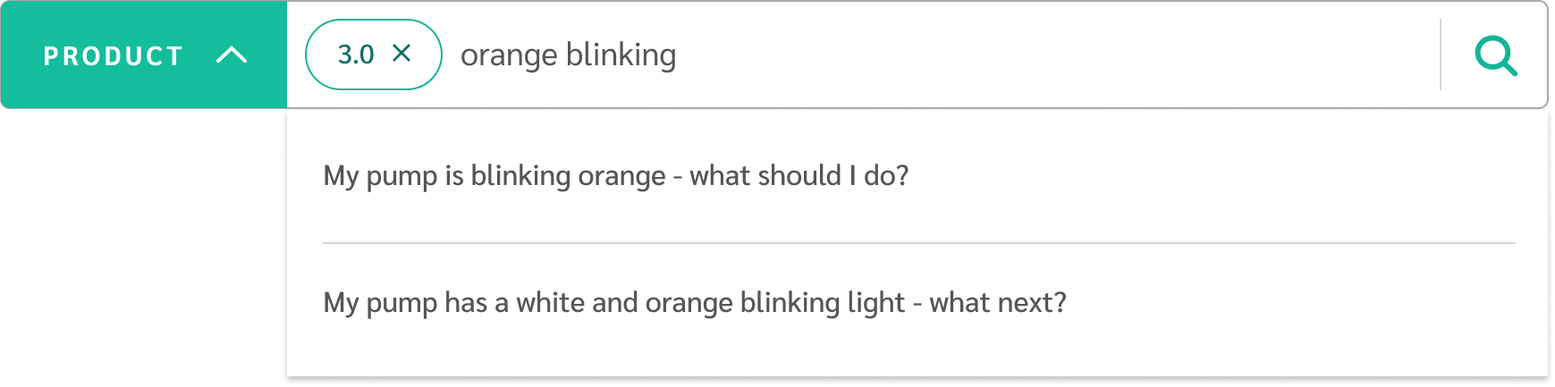
Advanced search feature that includes product selection filter and search within that product.
Final Deliverables & Handoff Integrity
The final solution was a responsive website design that elegantly merged Willow’s new visual brand aesthetics.
To ensure the final product looked exactly as intended, I built a thorough, organized component style guide in Figma. I then walked the developer through every single screen, explaining how the elements should move and adapt on mobile screens, and made sure they knew I was available to help clear up any confusion during the build.
Impact & Outcomes
10% Fewer Customer Calls: By cleaning up the layout so articles were easy to find and read, the new Help Center successfully helped users solve their own problems, cutting standard customer care calls by 10% and lifting some burden off the internal support team.
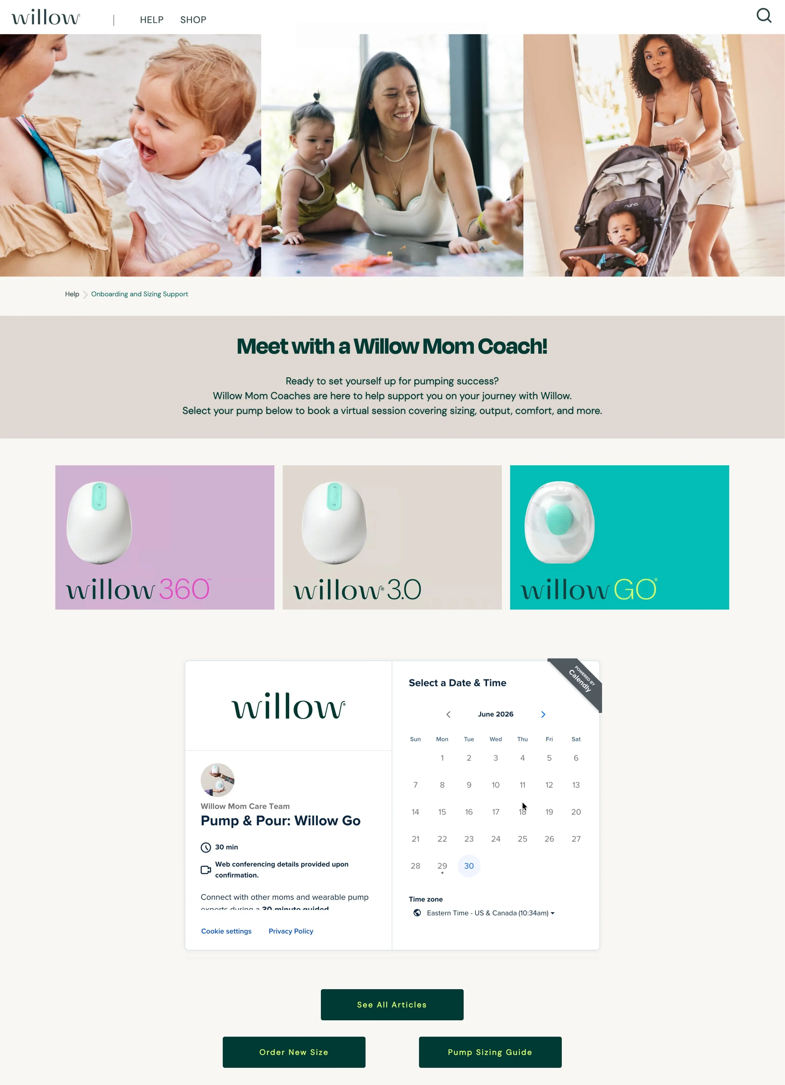
A Smart Mix of Human and Digital Care: Our data showed that digital troubleshooting was a huge help, but because breast pumps are highly personal and complex, you can never completely replace human care. My early recommendation to balance the website with personal outreach was proven right later on when Willow added a direct calendar link, letting moms easily book live, 1-on-1 video sessions with their Care Team.
"To build trust and eliminate friction, users should always have an easy way to connect with a real person."
Key Takeaways & Lessons Learned
“Contract constraints meant I wasn't able to see this through to post-launch optimization, but this project again proves my belief that a designer’s best ally is a developer. Re-evaluating design to quickly pivot platforms requires leaving ego at the door and identifying the best strategic compromise for the user and the business timeline.”
Getting Technical Early: Having to adjust our plans for Salesforce mid-way through taught me a valuable lesson. Today, I use this experience to encourage teams to bring designers and developers into the conversation on Day 1—saving time and preventing surprises before any sketching even begins.
Remembering the Support Pages: This project reminded me that even great, user-focused brands sometimes forget to apply good design principles to their help and documentation pages. It showed me how much a well-designed support site directly affects customer happiness and business costs.