CityPups Design Sprint: Increasing Dog Adoptions in Urban Environments
How I completed a 5-Day Design Sprint to help city dwellers find the right dog for them and to increase dog adoptions rates.

DURATION: 5 day Design Sprint MAY 5, 2024 – MAY 10, 2024
MY ROLE & TEAM: Solo UX designer with guidance from my mentor and supporting mentors
TOOLS: Figma, Photoshop image, Gemini AI
This was a design sprint for Springboard. The project I chose was CityPups, a startup that wants to help people living in cities find and adopt the right dog for them and increase the adoption rate. The assignment was to run a design sprint to come up with a few quick solutions to the problem. CityPups wants to concentrate on the user's unique needs: location, living spaces, schedule and transportation, outdoor space and other city specific criteria.
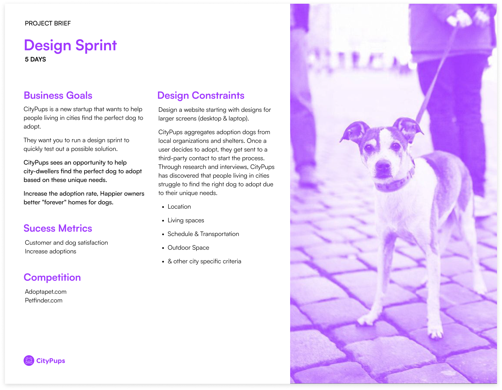
Problem
Help users find the right dog to adopt and increase adoption rates.
SOLUTION: I proposed a robust user-friendly filtered search experience on the homepage that narrows the search with each selection with an up to date refresh with each selection.
Research
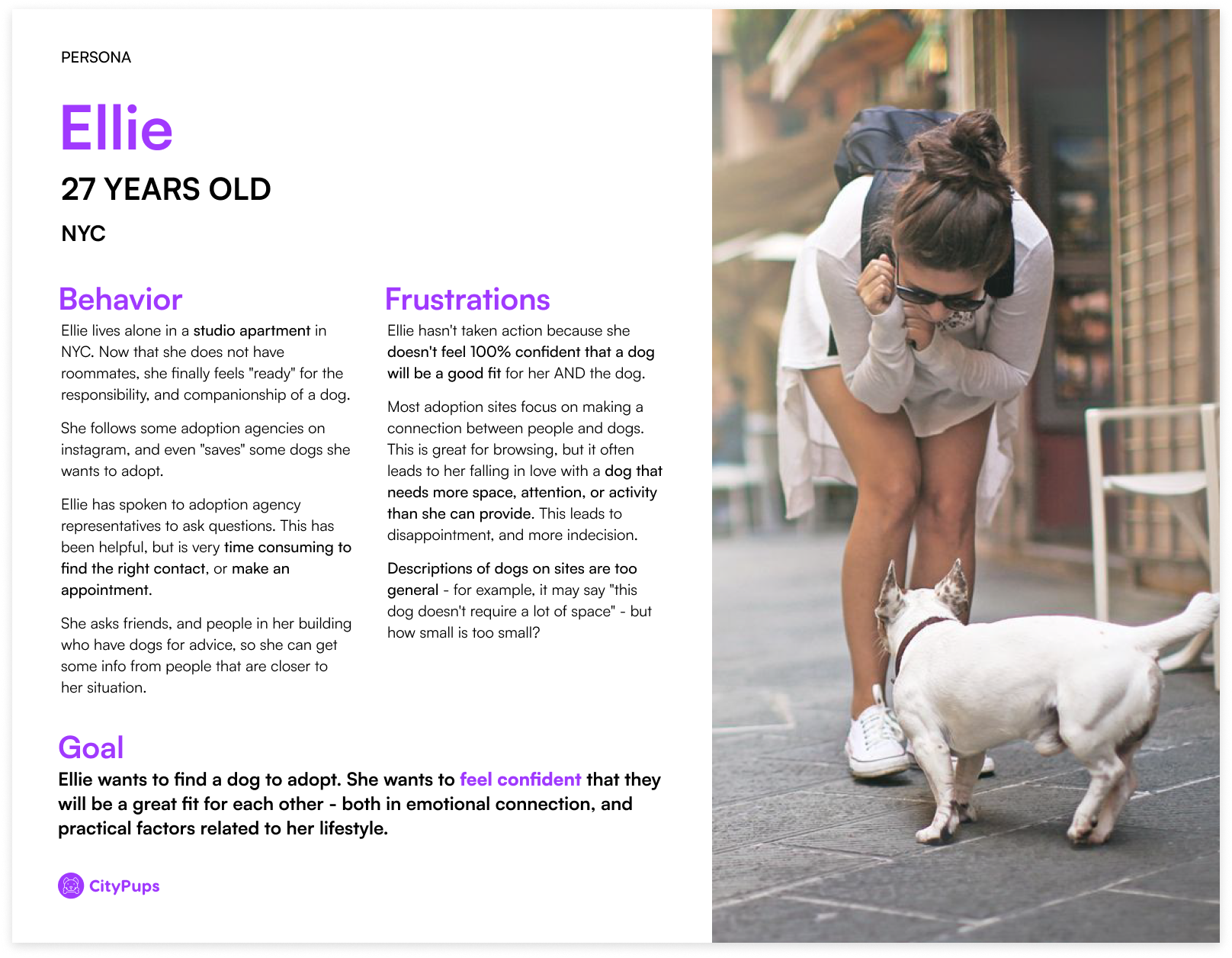
Persona
CityPups already had a persona, Ellie. She’s 27 years old and living in NYC. She’s experiencing lack of confidence in choosing a dog because she’s unsure of finding the right dog. Talking to agency representatives is good but time consuming and it’s hard to find the right contact or make an appointment. She feels the adoption sites are too general and she has specific needs she wants to make sure fit her criteria so her and her new pup will be happy.
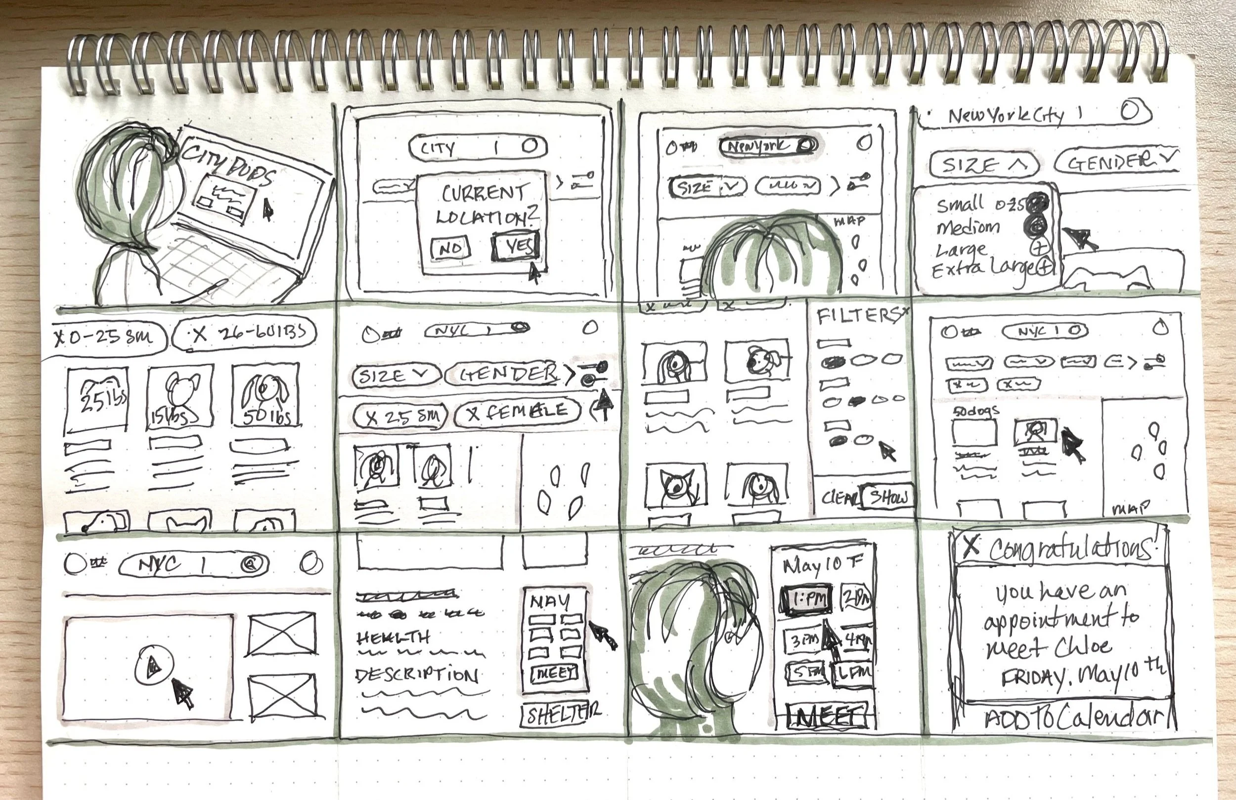
Day 1: User Map
For day 1 of the sprint, I chose to draw one map and include four options to search for a dog. The solution I chose to continue with was the Filter Categories.
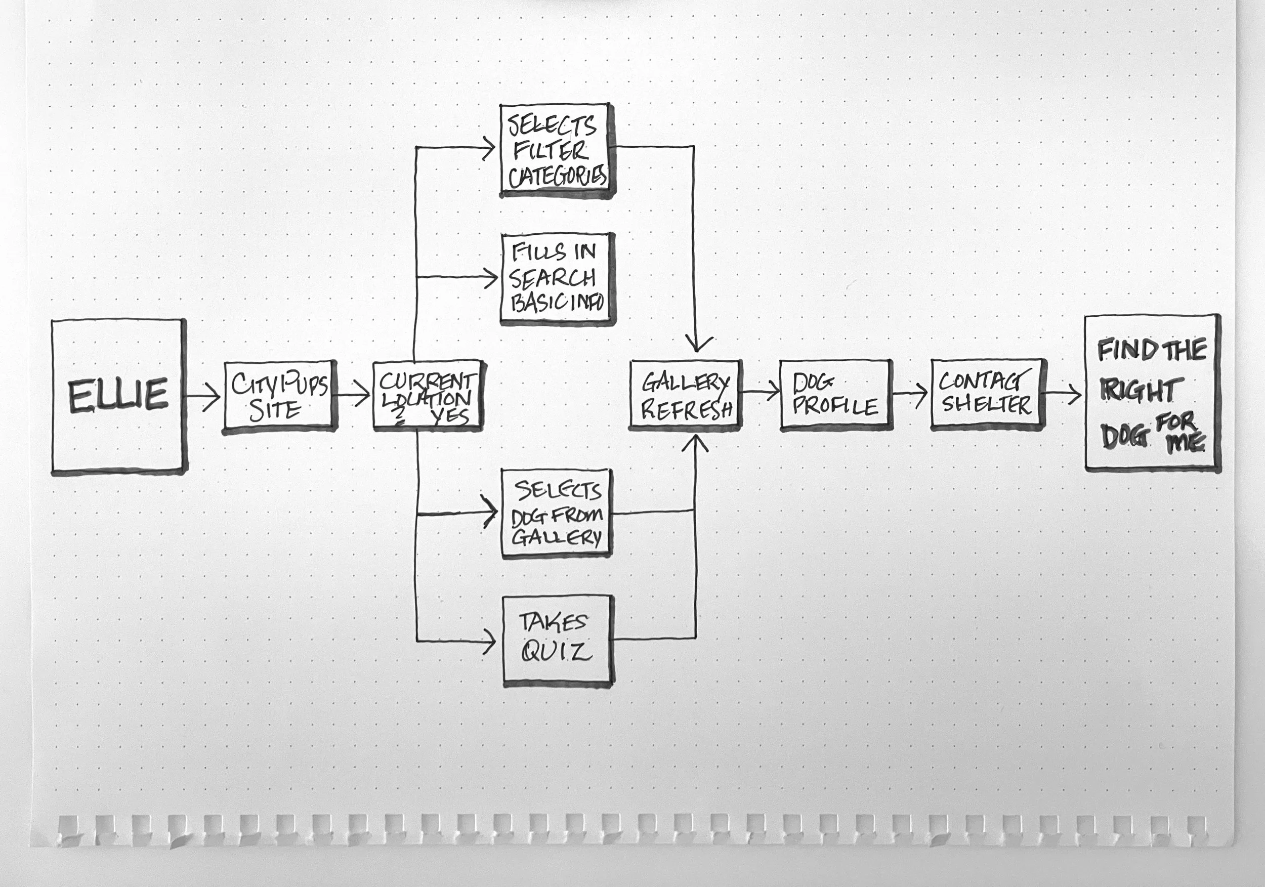
1. Ellie arrives on CityPups site:
She selects “yes” to use her current location on this site from a popup. She sees that her location is automatically entered into the search bar.
She selects filter categories to narrow down her search until she feels like she’s added all her specifications.
From here, she browses the available dogs in the image gallery, looks at image thumbnails with basic stats.
She selects one dog that she really likes from the basic information listed below the photo.
She views the dog’s profile, video, and photos, browses its basic information, sees its health report, and the shelter location. There’s a little information on the shelter contact information.
She decides she'd like to meet this dog so she selects the CTA button “Schedule a Meet and Greet” with times to schedule a visit to the shelter.
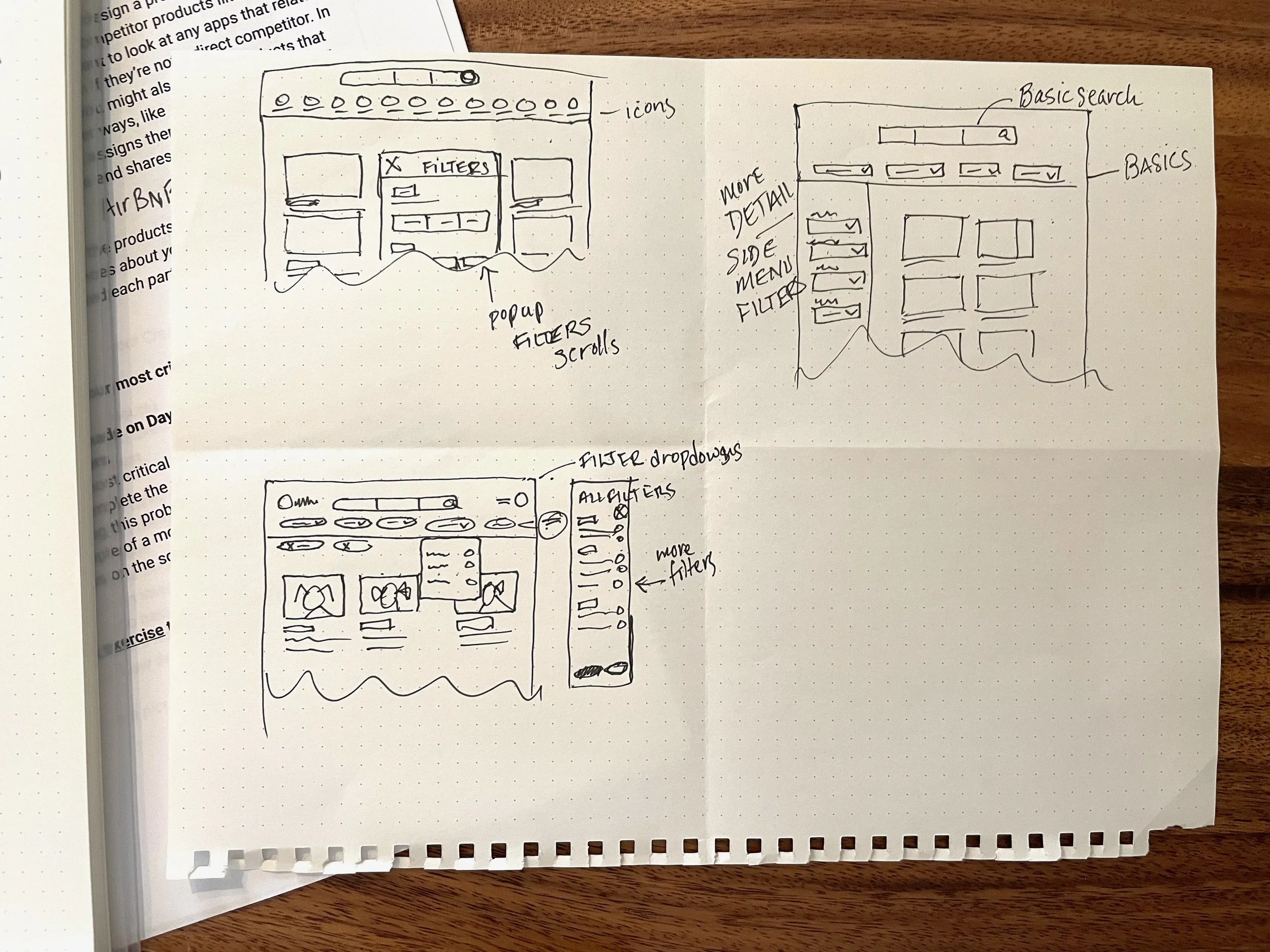
Day 2: Sketching the Solution
Competitors
CityPups direct competitors are adoptapet.com and Petfinder.com. I prefer Petfinder’s interface more than Adopt a Pet, but I see how both could be improved. For instance, I like the accessibility of the left side menu filter search on Petfinder, but I would like to see more room for larger photos or more dogs. Plus, I like the idea of seeing a map of nearby shelters on the home page.
CityPups competitors: Petfinder (top row) and Adopt-A-Pet.
Lightning Demos
What I came up with was a combination between Airbnb’s filter navigation and Ikea’s filter navigation. I really like the clean minimalist feel of the design. The filters auto-refresh the gallery of dogs when each filter is selected.
I was inspired by AirBNB’s approach to a filter search. I love the characteristic icons with text underneath for accessibility and the use of the horizontal scroll. The design is so light and airy with the large rounded buttons. When I discovered what this project was, I immediately thought of this approach.
Filtering all specifications with real time results and never leaving the page.
The addition of a map of locations gives an idea of the Travel distance and shelter location right away.
Popup for the expanded filter menu.
The one thing that concerned me was if the category icons would make sense. There are some instances where there are multiple selections. I need to think of a way to solve that issue.
Ikea’s filter search is also really nice, more simplistic than AirBnB’s. The chips are very prominent, clear, and easy to see which ones were chosen. It has a side filter menu that expands when you select the “All filters” button. Overall, Ikea’s approach feels more realistic than AirBnb’s, but I like both applications.
Crazy 8s Exercise
I spent 8 minutes drawing quick sketches of possible solutions. I tried a version with icons and text filter search like Airbnb’s. The other is using a similar approach to Ikea by using a dropdown menu solution.
Day 3: Decide and Create a Storyboard
Though I really like Airbnb, I just wasn’t sure how that would end up looking without seeing a mockup. I had more confidence in the dropdown filters approach. Also, there would need to be more time to work through the information architecture to see if the number of items would be overwhelming for the user.
Day 4: Prototype Your Solution
During Day 4, prototyping my solution, I began to question the effectiveness of my initial design approach. To address this concern, I decided to create two flows, Flow 1 (Icon/text filter search) and Flow 2 (dropdown filter search) and I would run a simple A/B test on Day 5, Validate. It made me feel better to know I had taken the extra step to ensure the usability thoroughly.
CITYPUPS FLOW 01
CITYPUPS FLOW 02
Day 5: Validate
For this design sprint, I conducted moderated remote usability interviews with 5 participants. The interviews lasted approximately 15 minutes and covered two user flows. I initially favored a specific solution, but as the sprint progressed, I began to question its complexity. To address this concern, I decided to test two solutions and A/B tested.
The testing results revealed that the solution featuring the icon/text filter search caused some confusion for most participants. Three participants suggested combining the two solutions, expressing appreciation for the icons but finding them potentially overwhelming with so many (one participant’s thoughts).
“I can easily imagine a world in which infinite characteristics can be implied…I would prefer Flow 2 just from a usability standpoint. Aesthetically, I like these little icons from the first flow. You could marry the two.”
— Participant
One participant loved the icons and it sparked a discussion on potential solutions after sharing her feedback. This conversation led me to the realization that I could use fewer icons as categories and group items under these categories. This approach confirmed the viability of my initial solution. By using more white space and fewer icons, I retained the unique filter search concept while creating a cleaner interface that prioritizes user experience.
Overall, all participants liked the approach and the design. I did end up editing Flow 1 to include fewer icons that would all have dropdown menus.