Gabbi Product Demo
Empowering women with breast cancer prevention and early detection tools.
CASE STUDY
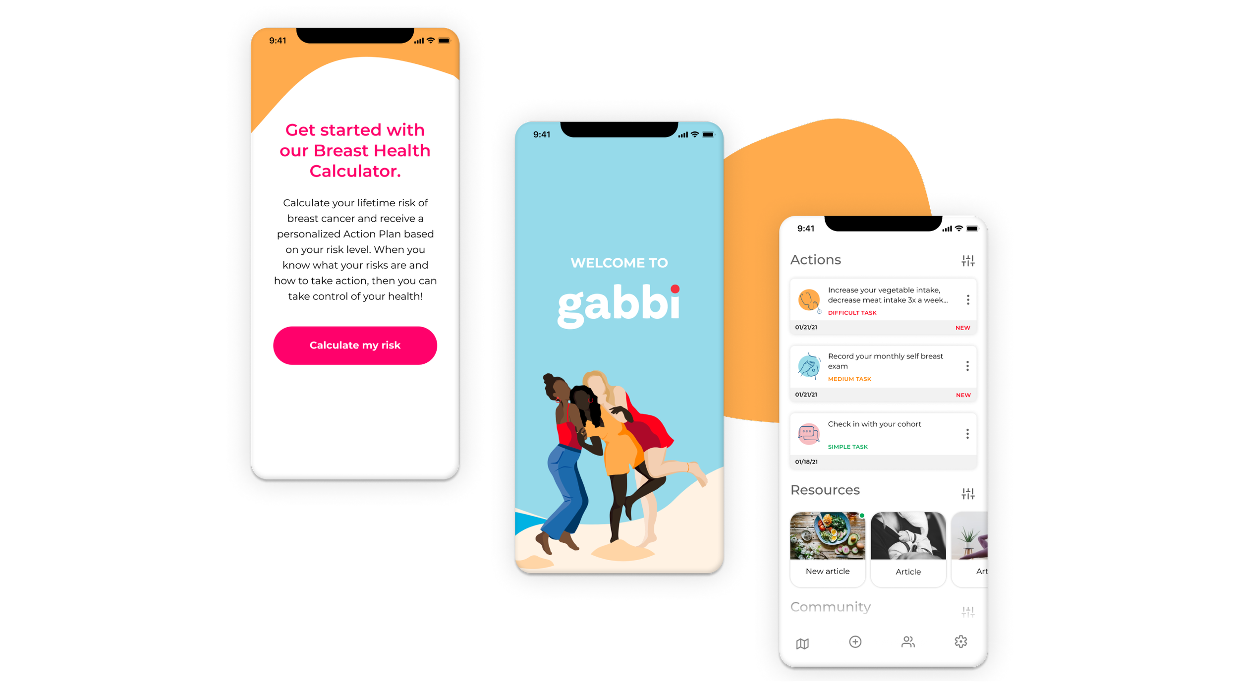
We want to provide a simple way for women to track their breast health so they can take action early.
THE PROBLEM
Gabbi is a health tech startup empowering women to understand their own health and to proactively seek the care they need. Gabbi helps health systems identify, engage with, and monitor patients to deliver better care with better outcomes, at maximum reimbursement.
This product demo was created to present to potential investors. We set out to illustrate a facet of the value Gabbi would provide by helping women stay on top of their breast and sexual health.
MY ROLE
I was the UX UI designer and creative lead on this project ideating early concepts, participating in design sprints, presenting regularly to leadership, and delivering final assets for production. Partnering closely a small team of designers and engineers, product manager, data scientist, and founder.
MY PROCESS
Personas, user stories, wireframing, prototyping, branding

Getting started
Once we had our team ready, the product manager involved the team in a series of workshops in Miro to explore as many aspects of the product as we could in order to start the process. We were able to use this information to then develop more specific personas and create 3 user stories to help apply to the product demo.
A user story is a brief, concise description of a task from the perspective of the user. For example: “As a woman, I want 'some goal' so that 'some reason'.” A user journey is a described series of steps that show how a typical user would interact with the web app that is being designed.
Who are we trying to help? We updated our existing personas to three, using information gained from user interviews. We used those to create three user journeys that I then translated to a user flows.
Following the user stories and personas for the demo, I sketched some initiial wireframes to get a general idea of what I felt the screens should contain before digging in to designing the digital user flow and prototype.
Branding
Branding was one of the areas I helped to build on. I started with the existing elements that had been done on the brand to set up and update colors, fonts and components from other projects to bring the brand to the next level. I was able to pull in the new illustration style and some new icons we had created.


Design
We incorporated bold colors to convey confidence, and unapologetic femininity. Red being the primary color. Color was a challenge to create a spectrum of color combinations that work together without feeling chaotic. I created a component library of Typography, buttons, icons and colors.

Prototype
I started creating screens in Figma, once I had a good idea of the direction. There was a lot of back and forth feedback with the team about how the screens should look and what content would make sense for the user experience.
Summary outcome
We designed three user flows to present to investors. Each showing different use cases based on the personas we created and the user stories. The challenge for me was creating a design from very little to go on. We were still in the first stages of the startup so much of what we created was based on some initial user interviews, competitor research, and business goals and strategy.
RECENT WORK

SynFit MVP App
Assisting stroke survivors in regaining strength and promoting healthy lifestyle changes for prevention.
MY ROLE: UX DESIGNER, CREATIVE LEAD
View case study →
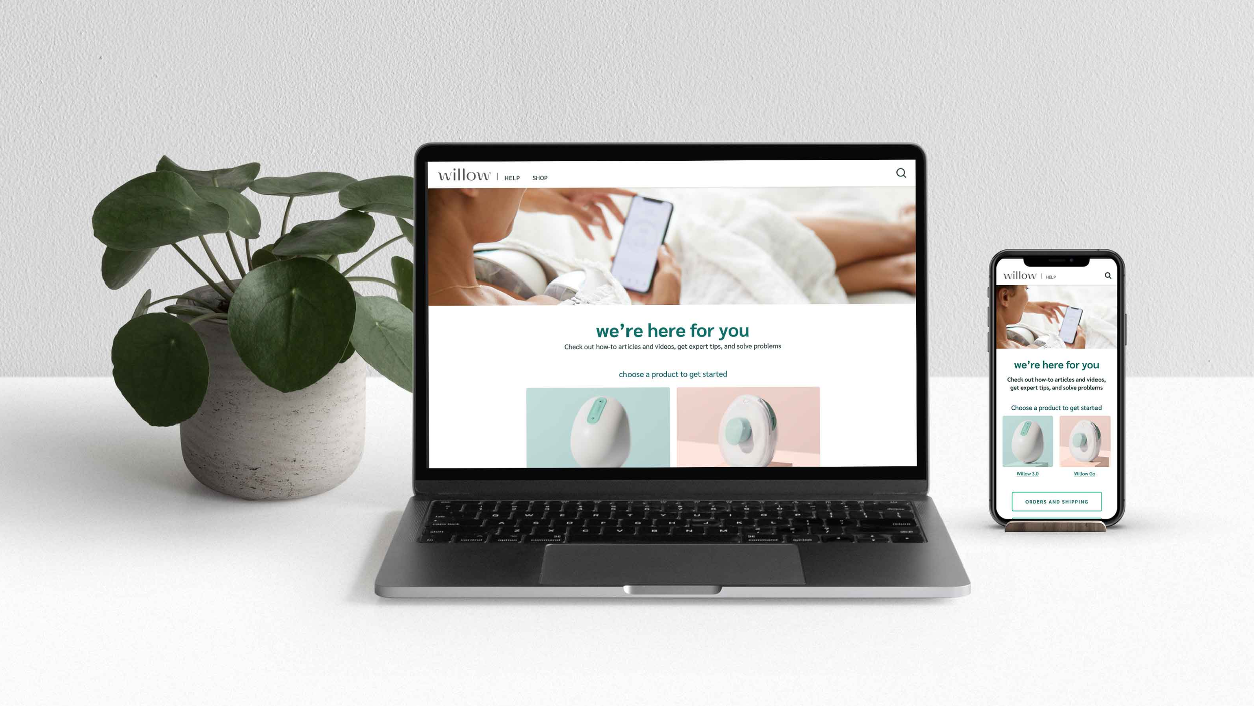
Willow Help Center
How-to articles and videos, expert tips, and product problem-solving for Willow moms.
MY ROLE: SENIOR VISUAL DESIGNER
View case study →