Willow Help Center — Balancing a Redesign with an Evolving Brand
How-to articles and videos, expert tips, and product problem-solving for Willow moms.

Overview, Role & Team
The Mission: With a timeline of 3 months, redesign Willow's outdated Help Center and create a responsive, interactive troubleshooting tool to support new product launches and an evolving brand identity.
My Role: Senior Visual Designer. Led end-to-end UX/UI, interaction design, and visual infrastructure. Responsibilities included ideating concepts based on user data, presenting to leadership, and delivering final production assets.
Cross-Functional Collaboration: Partnered with the Creative Director, Project Management, Head of Mom Experience, Technical Program Manager, and Development teams to ensure a seamless, cohesive user experience.
Tools: Figma, Adobe Creative Cloud.
The Problem
The existing Help Center was outdated and couldn't support Willow's upcoming product launches. The content and branding was outdated, the user experience was clunky with high customer support ticket volume and bounce rates.
Solution: Moms need quick, seamless troubleshooting to get their pumps working without frustration. Additionally, the final design needs to be flexible enough to absorb a rolling, incomplete brand overhaul.
Research & Data
The Data: What did that existing user data actually revealed that mom’s were having trouble troubleshooting their breast pumps and would frequently need to call support. An high return rate due to frustrations with assembling the product. (e.g., "Data showed 60% of moms left the site if they couldn't find an assembly video in two clicks.")
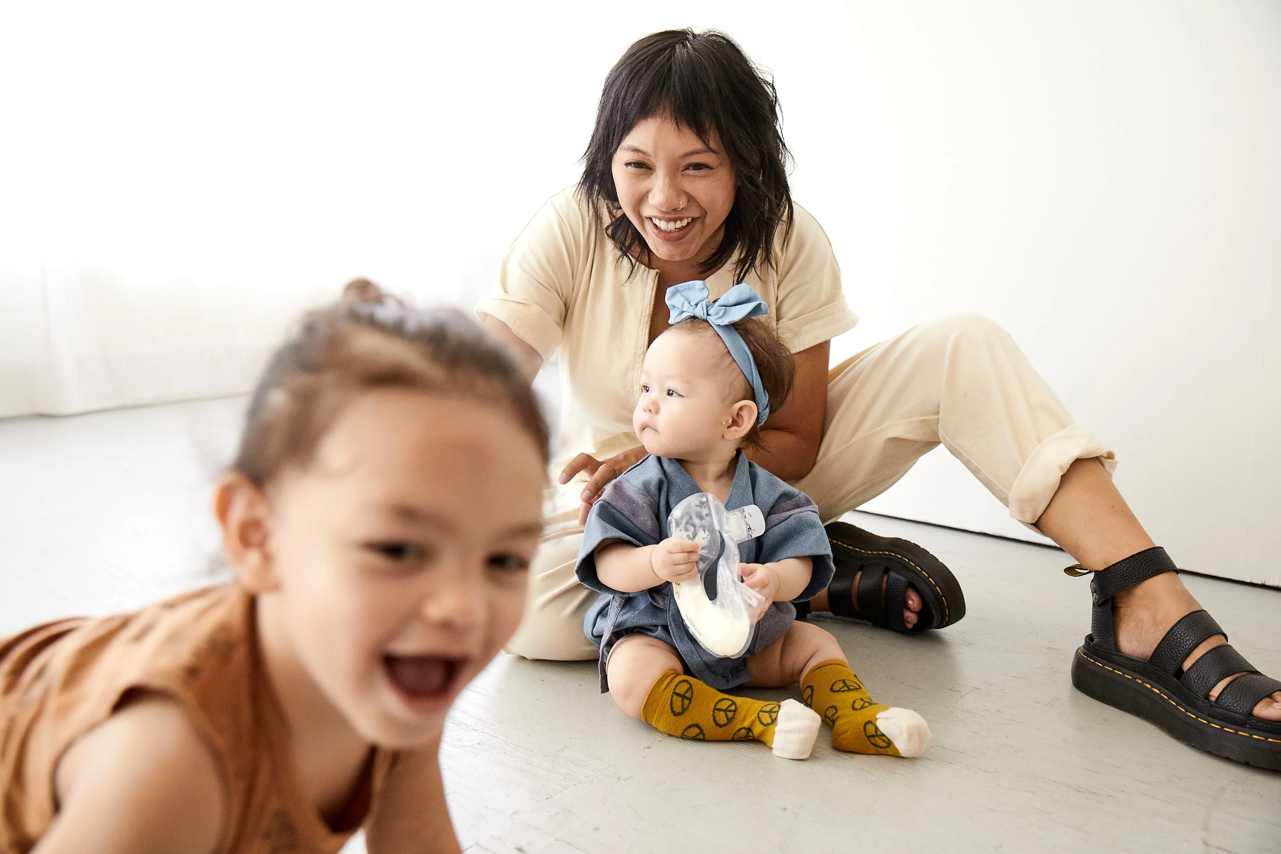
User Persona: Willow Mom
Sleep-deprived, multitasking, needs hands-free, and clear answers fast. She’s busy and doesn’t have time for complicated instructions or products that are hard to assemble.
Design Process & Solution
Your listed process: Information Architecture ➔ Wireframing ➔ Prototyping ➔ User Testing
🔴 What’s Missing Here (The Core of Your Case Study):
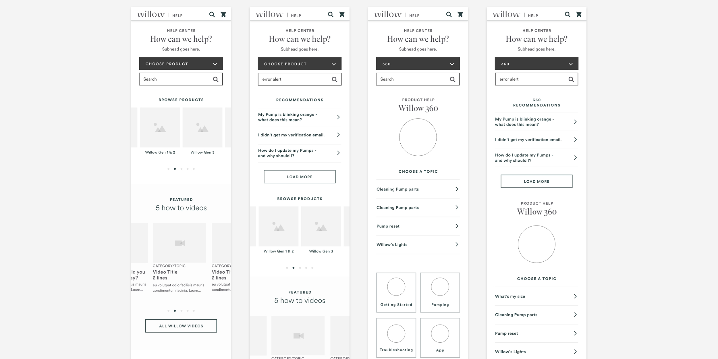
Information Architecture: Show or explain how you reorganized the help articles and videos.
Wireframes & Iterations: Show low-fidelity sketches or wireframes. How did you lay out the interactive "Troubleshooting Check Assembly" flow?
The Evolution: Since the branding changed later, show how your UI layouts were built to be modular or adaptable.
Final Deliverables & Handoff
The responsive interactive Help website and Troubleshooting session were handed off to development and launched a few months later.
🔴 What’s Missing Here:
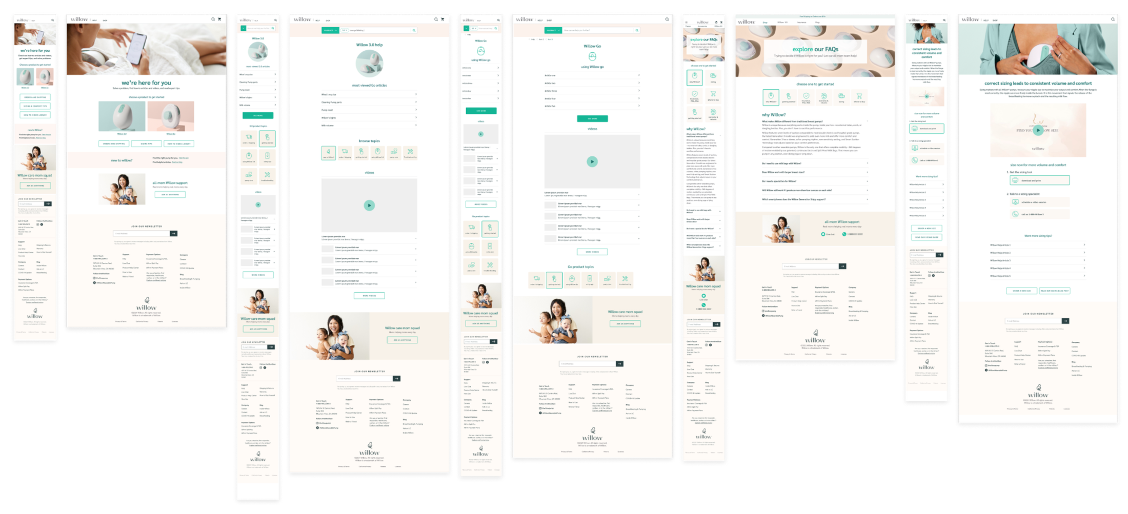
Visuals: High-fidelity screenshots of the website and mobile responsive views.
The Interactive Flow: A GIF or prototype link of the assembly troubleshooter.
Final Deliverables & Handoff
Retrospective & Business Realities
Designing for Complex Workflows: Hardware products are inherently complex and constantly evolving. While my designs aimed to solve assembly issues digitally, I recognized early on that automated troubleshooting couldn't fully replace human support for a product this intricate.
Navigating Budget & Platform Constraints: Due to budget limitations and engineering constraints during the broader rebranding, the client launched a scaled-back version of the digital redesign rather than investing in the full interactive flows I proposed. While a comprehensive video library was part of my original design, implementation was ultimately limited by the technical constraints of the client's Salesforce platform.
Validating the Concept: Proving that the product still required human intervention, Willow later implemented an integrated booking calendar for live sessions with their Care Team. This validated my initial assessment: when budget limits digital UX solutions, the business must bridge the gap with operational support.